Type & The Grid
Sarah showed us a really interesting video today. I absolutely loved it because it talked about 8-bit fonts, which was really intriguing because I love playing 8-bit games.
One of the comments said that it's amazing how constraints are sometimes the fuel for the most interesting creativity. Which I totally agree with, but it's also hard when you feel like you can't think of anything else!
Anyway, on to the workshop exercises.
For the first exercise...
We had to fill in squares in an 8x8 grid and construct 2 variations: a version that is representative and a version that is abstract. Here are the initial results...

The ones on the upper right (looks like an alien glyph) and bottom right (staircases!) are where I've tried to be more abstract. I must confess I do find it hard to visualise abstract images. You can see where I've tried to add serifs to the 'B' on the bottom left. Realised that adding and subtracting squares makes some slight but noticeable changes to the shape of the B, which changes it's character.
On to the second exercise.
Now with only straight or curved lines, we had to draw our letter shape and whatever characteristics we could think of: serif, sans serif, minimalist, decorative, italic, condensed, ultra black, super condensed, you name it.

Obviously the first one shows that I haven't gotten my head out of the previous exercise...
You can see that I've explored some cursive as well as with weird (and inaccurate) perspective. Normal-looking B's but also some weird shapes (puzzly jigsaw version...?).

With time running out, I quickly sketched a few more down...
I wanted to make a 3D one, but getting the perspective right is really difficult!
Now, the last exercise...
Working with a combination of the above, we had to use the graph paper again to compose a large-scale modular version of our letter — this time with a textural or 3-dimensional quality of your choice, whether abstract or representative, to convey the personality or character of your letter. One letter, full scale on the one sheet...
There wasn't much time to do this in class (only 15 minutes!) but the 3D prompt made me remember a game I used to play - Monument Valley. It cleverly uses optical illusions and impossible objects - I really wanted to create one with the B letterform. I looked up online and found that somebody had done it before - the Impossible B!
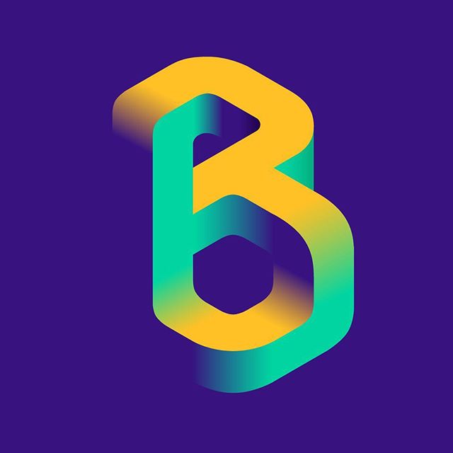 |
| Reference image by anana.uy. https://im-possible.info/english/art/computer/anana.uy.html |
I really wanted to do something like this but I didn't know how to visualise it in my head. So I tried to reference and copy it first. But because it was so big it took a really long time to shade it in.

Obviously, it didn't turn out very well. I learned that shading and gradiation is key to the trick. Light and shadow - the trick is to blend the top surface with another top surface - and then 'attach' the entire block behind the stem so that it's blocked from the audience's view. There are other ways to do it too but this is the way this artist did it.
When I went home, I tried out some more designs using the graph paper provided...


What I tried and why, what I discovered or didn't expect to find, what might I develop further:
- Negative space can be utilised to make the 'B'. I just need to subtly define the bowls (partially!) and the stem.
- Realised that adding and subtracting squares do make some slight but noticeable changes to the shape.
- Creating an impossible letterform - shading and gradiation is key to trick our minds. But you need to get an even shading, so it might be better to do it digitally.
- I find it hard to go quite abstract. Not sure if it's because it's my personality or if I subconsciously prefer it that way but I do want to push out of my comfort zone. I might try sketching on the different kind of grid paper provided in class (it's more like a mozaic style) so that might force me to create with less straight lines.


Comments
Post a Comment